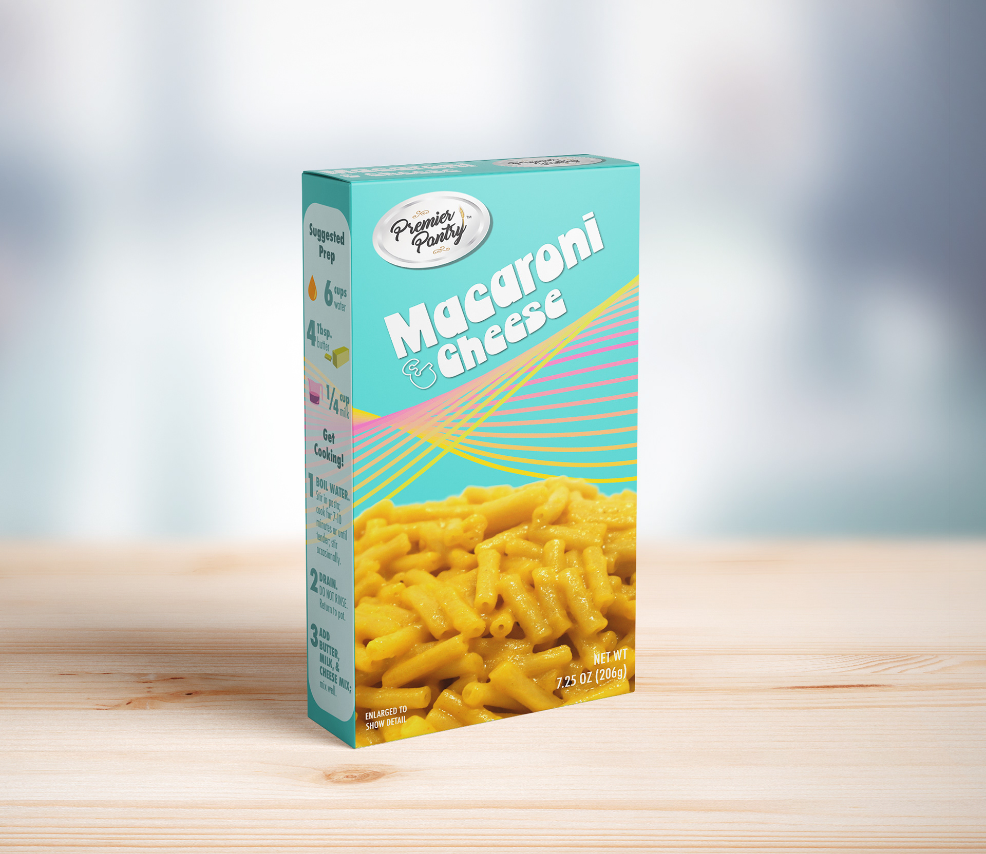
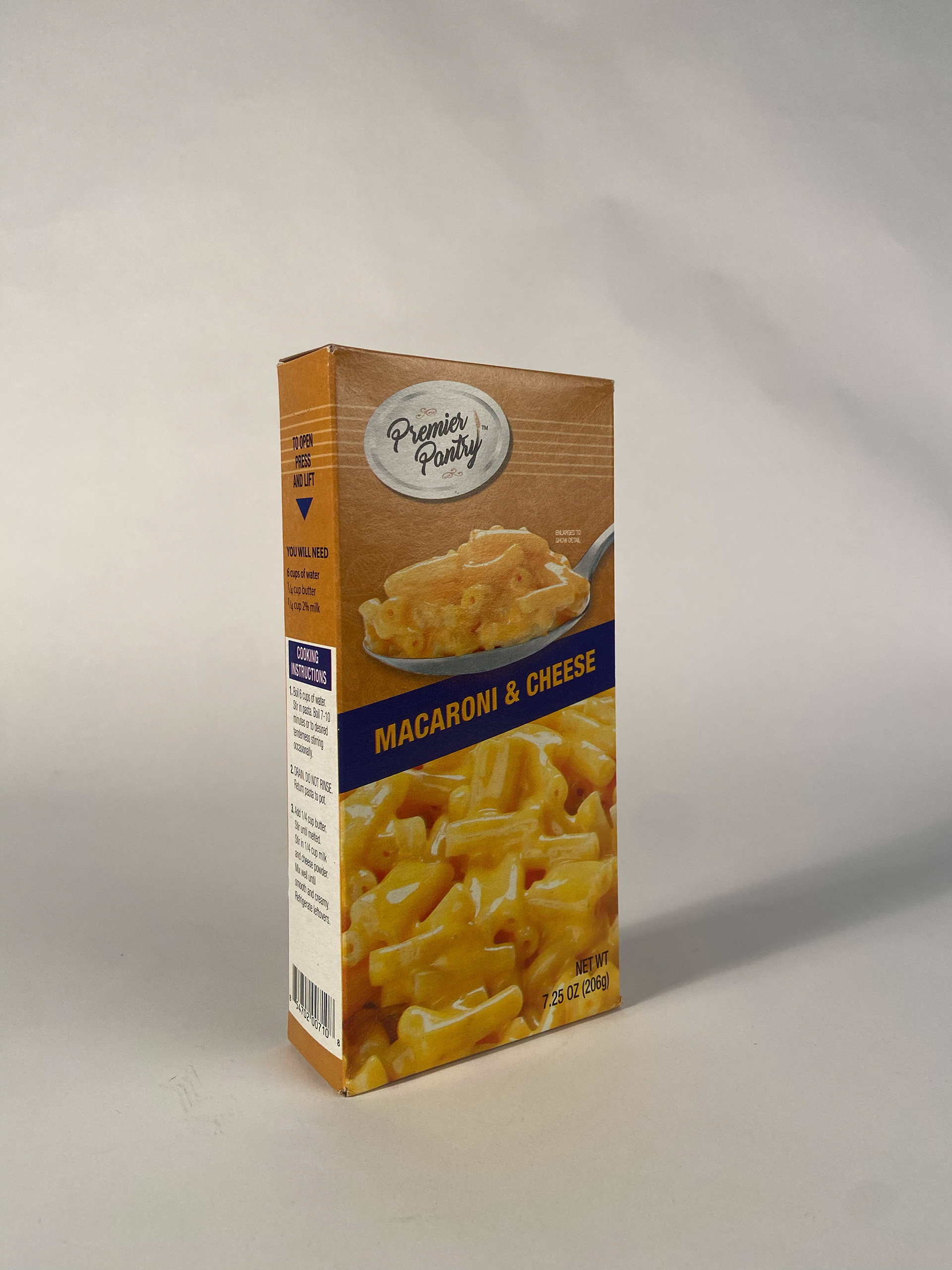
premier pantry: mac & cheese
packaging redesign
a refreshed packaging design for a kid-focused product, featuring bold colors and playful typography to better stand out on shelves and appeal to a younger audience. the redesign emphasizes clarity and shelf presence, making it more competitive than the original.

rhiannon: red wine
label redesign
a reimagined label design for my namesake wine, featuring minimalist elements, celtic knots, and mythological details. the update boosts legibility and refines the look—still distinctive, just a little less cryptic.

RHIANNON WINE LABEL: BEFORE
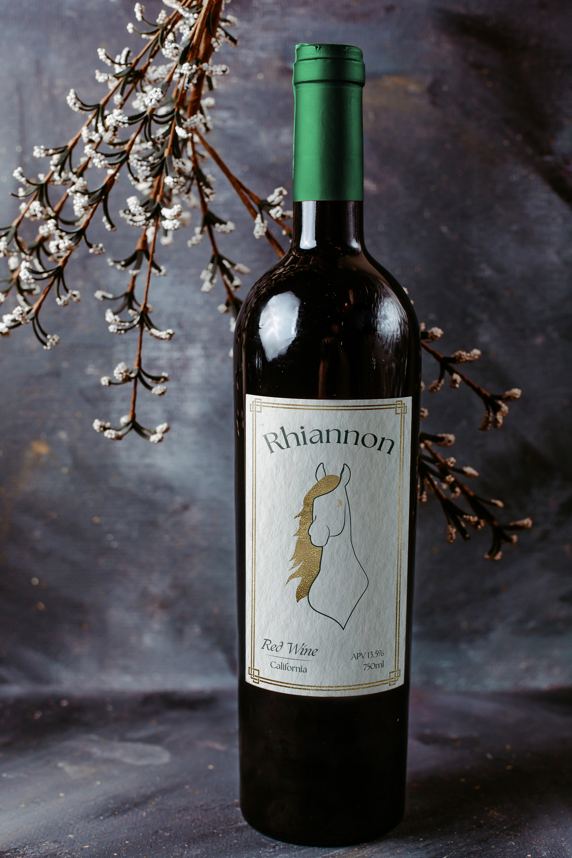
RHIANNON WINE LABEL: AFTER
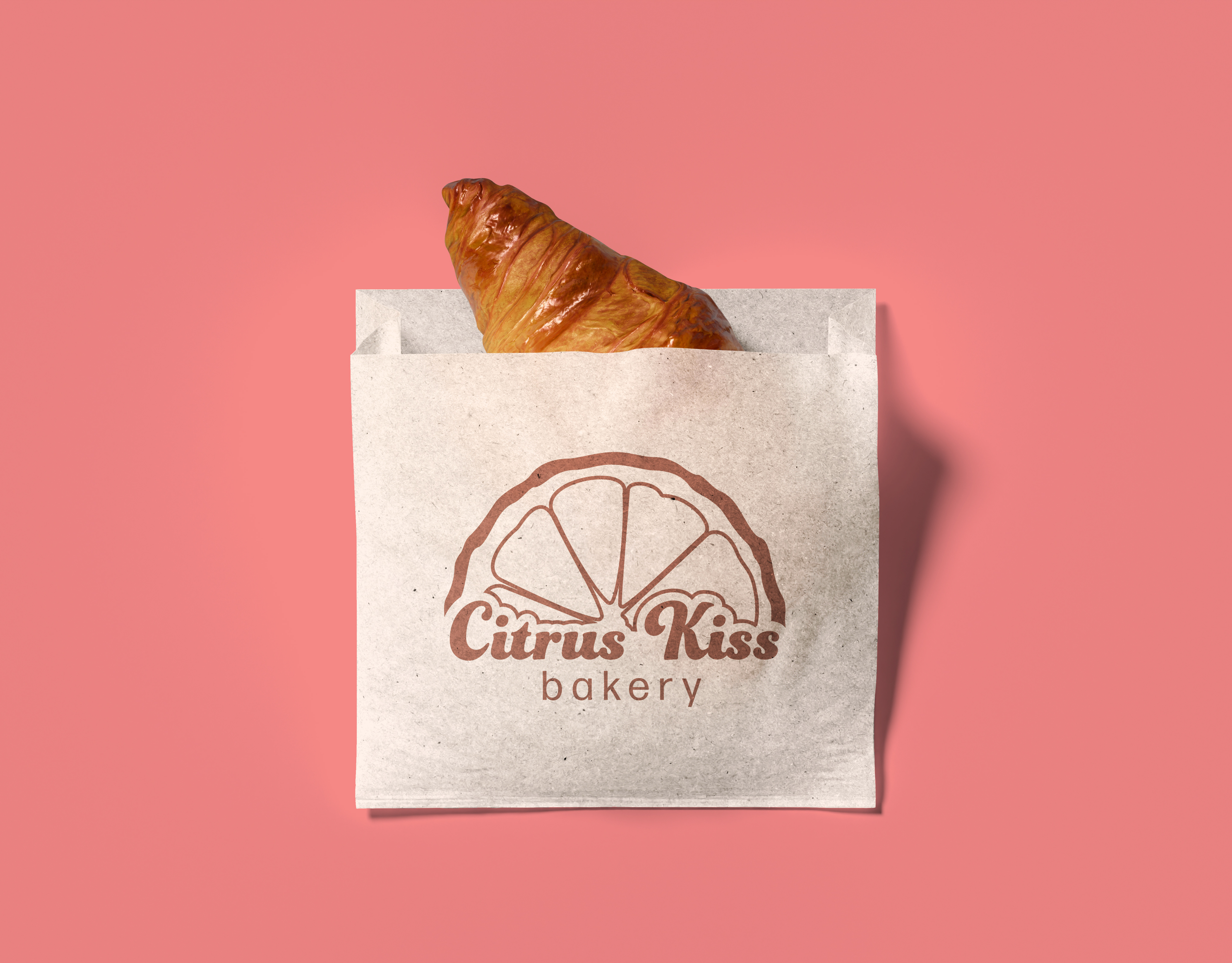
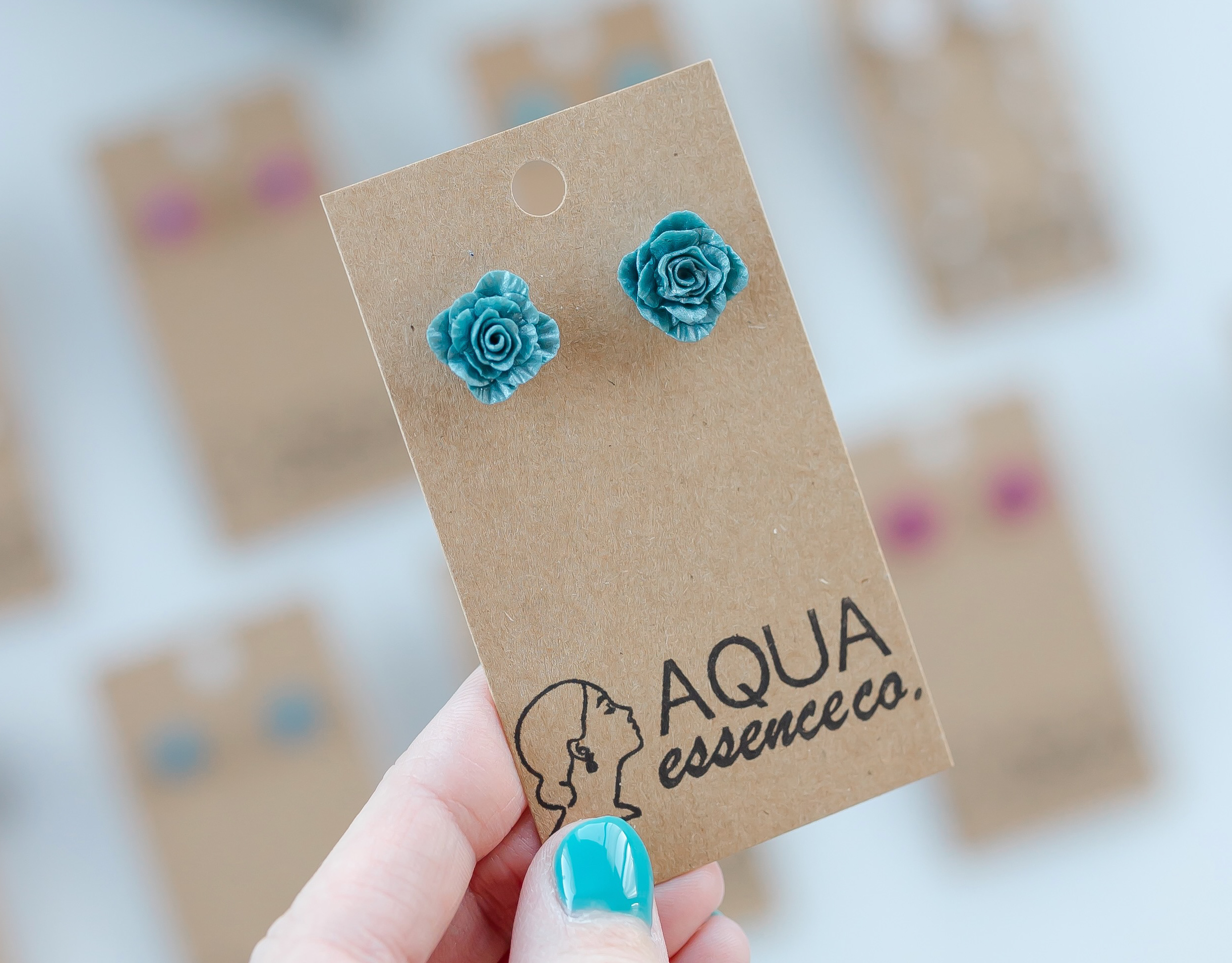
other packaging designs